Thursday, April 29, 2010

Studio Space: Presentation Board: A Blank Canvas


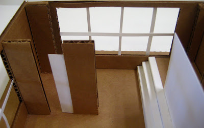
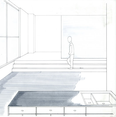
As the class was divided into two, half were assigned to the loading dock while the other half was assigned to the administrative office. At once, we grabbed as many tape measures as we could along with a pencil and our sketchbooks. Our first task was to receive the measures of the administrative office. Once we had exact measurements for the office, it was our job as individuals was to draw the floor plan and section elevations. As the plans developed, so did the concept for our final assignment. With the existing room, it was our job to choose an artist as inspiration. Whether the artist would be staying for a few days or few months, the space had to be accommodating. Inspired by photography, the New York and Los Angeles based photographer and director, Eric Ray Davidson, struck my eye. As I engaged myself in understanding his sense of style, I was able to receive ideas for the perfect studio space for him. The renovation began by deconstruction of the two interior walls of the office and a level change addition. Inspired by lofts located in New York City, I added a two step level change. The level change, accentuated with a partial frosted glass wall, was accommodating to the bedroom and bathroom area, as it added privacy while maintaining any open feel to the whole area. In my design for the studio space, I wanted to maintain an open feel allowing plenty of studio space for Davidson's work. By adding two partial walls, with a frosted glass pocket door, between the living area and kitchen area, it portrayed division while allowing it to still be accessible. Throughout the space, walls are limited providing plenty of natural light along with space. The studio space I design for Eric Ray Davidson, portrays simplicity and functionality, suitable to his personal style.

Studio Space: Model


Studio Space: Final Perspective Drawings


View of level change from studio space

View of living and kitchen area from studio space

View of living area and studio space from kitchen

View of private sleeping area and level change from kitchen

Studio Space: Final Floor Plan and Section Elevation Plans


Studio Space: Color Schemes

Monochromatic

Split Complementary

Analogous

Complementary

Color Wheel and Color Schemes


Studio Space: Perspective Drawings

View of kitchen area and level change from main entrance

View of level change from kitchen area

View of kitchen area from level change

View of bedroom area from entrance of level change

View of bathroom

View of kitchen area from level change

View of level change

View of kitchen area

View of kitchen area from living area

View of level change from kitchen area

Studio Space: Original Floor Plan and Section Elevation Plans

Administrative Office


Clues Six & Seven: Redesign the car/ More Style


After deciding on which car to draw, the next task was to mold it into something of our imagination. Whether it be giving it arms, transforming it into an animal, or giving it a futuristic style. Already having some character with it's original design, I used my imagination to incorporate my own style in the car's design. While looking at the Volkswagen Beetle, I envisioned the 1970's. In my eyes, the headlights resembled John Lennon's glasses. Incorporating the styles of the 70's into the design of my car, I dressed the car as if it were a hippie. Accentuating the bright and bold colors found throughout the 70's along with flowers and peace signs.

Clue Five: Pick a car any car


For this clue, we were given the task to draw a car, truck, or bus of our choice in two point perspective. Immediately, I decided I wanted to draw an older car, something vintage. While envisioning which automobile would be best to draw, a 1955 Volkswagen Beetle caught my eye. I always see this car as having it's own personality. With the big bug eyed headlights and rounded structure, a Volkswagen Beetle has character.

Tuesday, April 27, 2010

Clue Four: Changing Colors


Replicating my design for a reading room three times, I created a simple color palette applying each in a different style. Using my "Drawing with Confidence" as inspiration, I was able to experience the different styles of marker rendering. With a color palette of only three colors, pale indigo, cool gray #1, and warm gray #2, I used each color in a different space with a different technique.

Monday, April 26, 2010

Clue Three: Reading Room


For clue three, we were given the task to design a reading room including the three patterns we chose. For my design, I was inspired to represent the patterns as wall coverings, furniture, and the space's architectural elements. The challenge was to keep the room balanced. I feel as if I successfully accomplished this task, by carrying the flow of similar shapes throughout the room.

Clue Two: Processing Patterns


For clue two, we were given the challenge to develop patterns based from an object of our choice. As I gave the space around me a quick glance, my eye was draw to the bright colors and designs of Leslie's bag. The designs were each unique, giving me opportunity to be creative with each detail. Out of the 25 detailed patterns, I chose the three above, mainly for their simplicity and bold contrast between black and white.